
Barukas
My Role
Team Members
Tools Used
Timeline
Background
The Challenge
Information Architecture
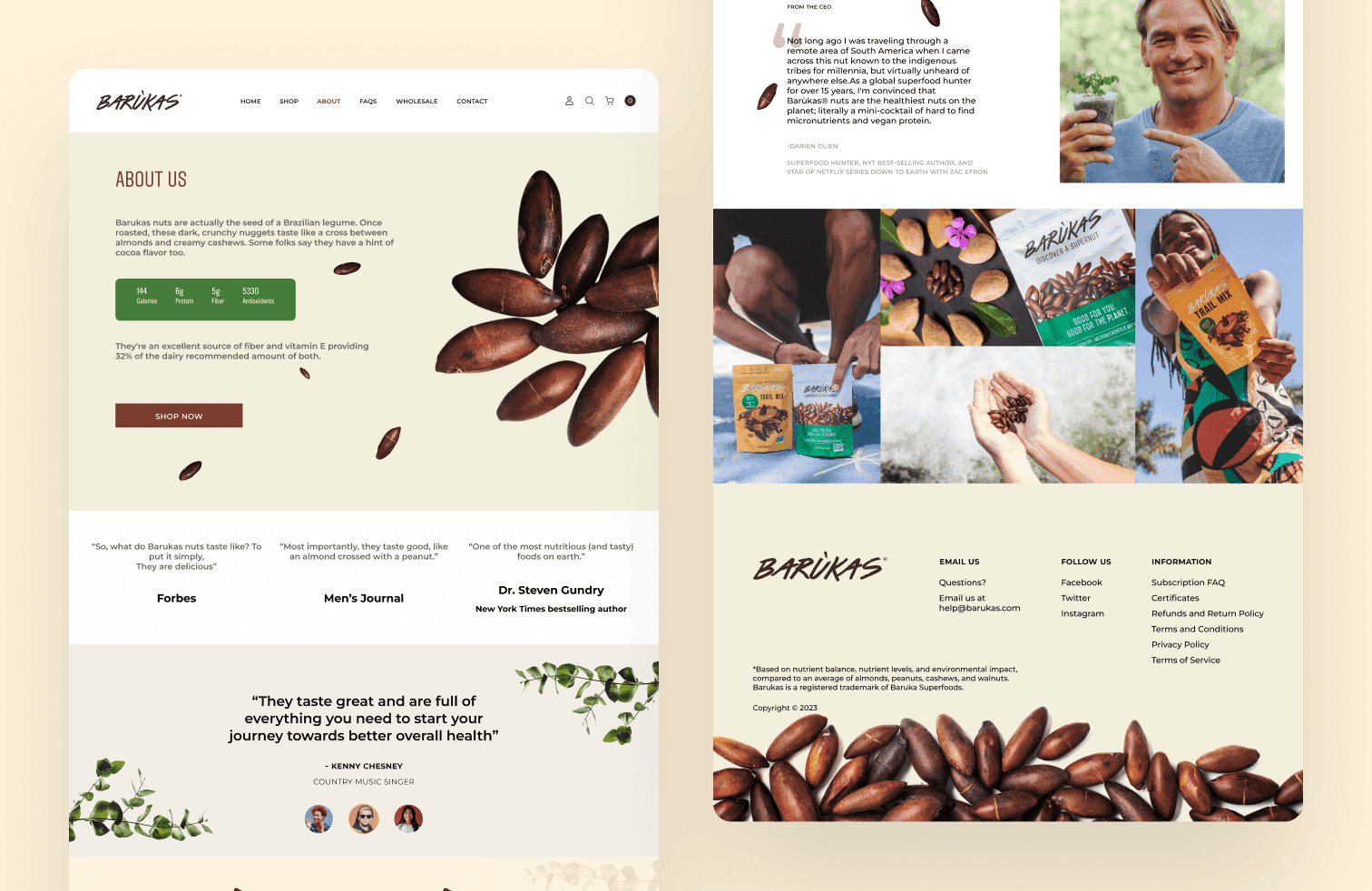
Barukas celebrates the baru nut, an antioxidant-rich supernut native to Brazil’s Cerrado, celebrated for its protein, fiber, and micronutrient density. Wild-harvested and sustainably sourced, Barukas brings a healthy, planet-friendly snack Ethically produced with certifications like HACCP and SMETA, the brand supports fair labor and environmental stewardship. Its narrative blends wellness, ecological responsibility, and cultural authenticity in every piece.
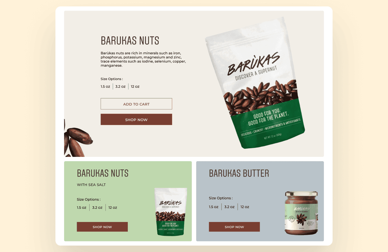
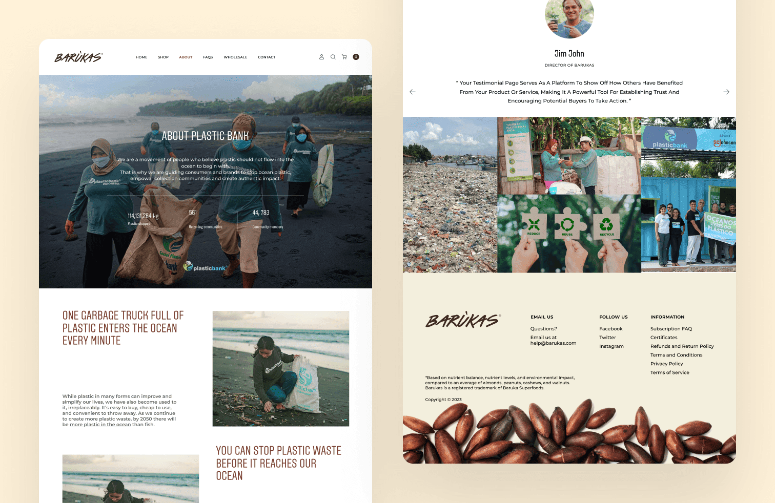
For this project, I led the website design, crafting an interface that brings Barukas' rich brand story front and center. The design prioritized clarity, visual appeal, and intuitive navigation to highlight product benefits and certifications. I structured content to balance data-driven messaging (e.g., health stats and sustainability) with emotional storytelling. The result: a sleek, engaging web presence that reflects Barukas's identity as both a health brand and an ethical disruptor.
Research & Exploring the Structure
User interviews were conducted by the core team in Tennessee. While I wasn't present for the sessions, I synthesised the findings with the team to align on which workflows were essential for mobile and which were better suited to remain on desktop. This conversation became the foundation for every structural decision that followed.
With the scope defined, three structural approaches were explored:

Assessments, sessions, and goals as separate destinations linked by session IDs. Familiar, but required jumping across sections to complete one task.

Navigation simplified, bottom nav removed, but the three still lived independently. Less clutter, same fragmentation.

Everything was organised within the session itself. One entry point, one context, no jumping between sections.
Option 3 was chosen because it matched how patients naturally think about their care: in terms of sessions, not categories. If a patient wants to do anything related to one session, they go there and nowhere else. It also clarified the mobile scope — the session was the sole task we wanted to support on mobile. Everything else that felt too complex was intentionally left on desktop.
Interactive Prototype

Barukas
My Role
Team Members
Tools Used
Timeline
Background
The Challenge
Information Architecture
Barukas celebrates the baru nut, an antioxidant-rich supernut native to Brazil’s Cerrado, celebrated for its protein, fiber, and micronutrient density. Wild-harvested and sustainably sourced, Barukas brings a healthy, planet-friendly snack Ethically produced with certifications like HACCP and SMETA, the brand supports fair labor and environmental stewardship. Its narrative blends wellness, ecological responsibility, and cultural authenticity in every piece.
For this project, I led the website design, crafting an interface that brings Barukas' rich brand story front and center. The design prioritized clarity, visual appeal, and intuitive navigation to highlight product benefits and certifications. I structured content to balance data-driven messaging (e.g., health stats and sustainability) with emotional storytelling. The result: a sleek, engaging web presence that reflects Barukas's identity as both a health brand and an ethical disruptor.
Research & Exploring the Structure
User interviews were conducted by the core team in Tennessee. While I wasn't present for the sessions, I synthesised the findings with the team to align on which workflows were essential for mobile and which were better suited to remain on desktop. This conversation became the foundation for every structural decision that followed.
With the scope defined, three structural approaches were explored:
Assessments, sessions, and goals as separate destinations linked by session IDs. Familiar, but required jumping across sections to complete one task.
Navigation simplified, bottom nav removed, but the three still lived independently. Less clutter, same fragmentation.
Everything was organised within the session itself. One entry point, one context, no jumping between sections.
Option 3 was chosen because it matched how patients naturally think about their care: in terms of sessions, not categories. If a patient wants to do anything related to one session, they go there and nowhere else. It also clarified the mobile scope — the session was the sole task we wanted to support on mobile. Everything else that felt too complex was intentionally left on desktop.
Interactive Prototype