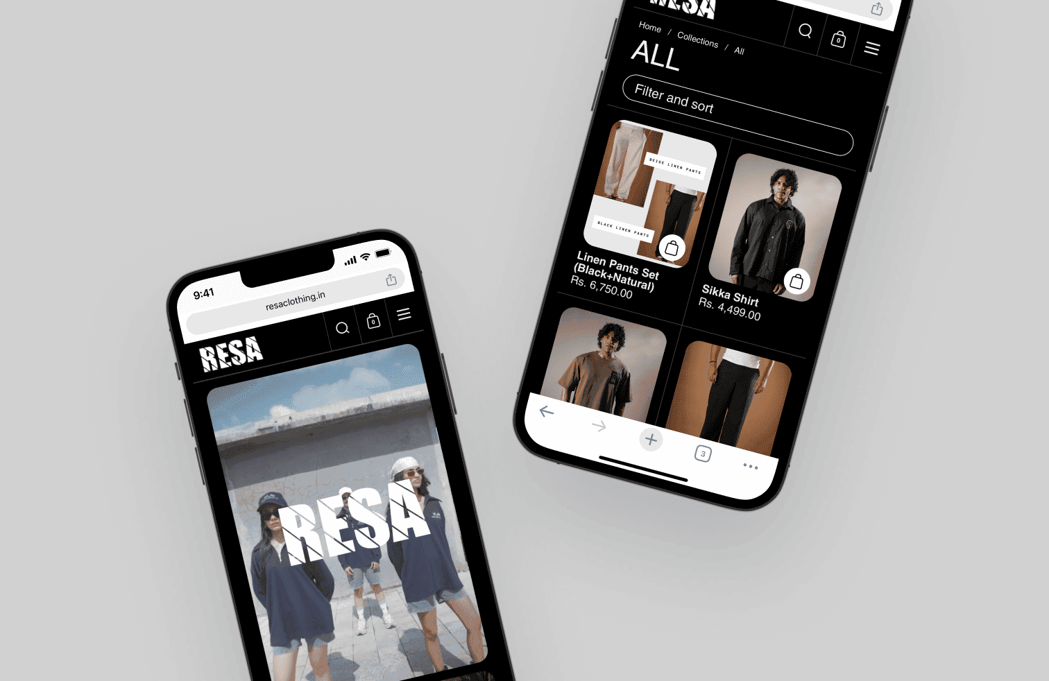
Resa Clothing
Background
The Challenge
Information Architecture
Resa Clothing was founded in 2022 by Deev Thakrar with a vision to push the boundaries of textile art and design. Inspired by Indian culture and heritage, the brand blends craftsmanship, storytelling, and contemporary fashion. Every collection is mindful from fabric sourcing to content strategy, reflecting creativity and attention to detail. With unique drops like the Minar Set, Resa delivers not just clothing but an immersive sartorial experience.
For this project, I handled the end-to-end design and development of the brand’s website, collaborating with one designer and one developer. My focus was on creating a clean, responsive design that captured the brand’s identity while ensuring a smooth development process. I worked closely with the client to meet expectations, refine details, and deliver a fast, functional build. The result was a digital presence that aligned seamlessly with Resa’s vision of artistry and storytelling.
Research & Exploring the Structure
User interviews were conducted by the core team in Tennessee. While I wasn't present for the sessions, I synthesised the findings with the team to align on which workflows were essential for mobile and which were better suited to remain on desktop. This conversation became the foundation for every structural decision that followed.
With the scope defined, three structural approaches were explored:

Assessments, sessions, and goals as separate destinations linked by session IDs. Familiar, but required jumping across sections to complete one task.

Navigation simplified, bottom nav removed, but the three still lived independently. Less clutter, same fragmentation.

Everything was organised within the session itself. One entry point, one context, no jumping between sections.
Option 3 was chosen because it matched how patients naturally think about their care: in terms of sessions, not categories. If a patient wants to do anything related to one session, they go there and nowhere else. It also clarified the mobile scope — the session was the sole task we wanted to support on mobile. Everything else that felt too complex was intentionally left on desktop.
Interactive Prototype
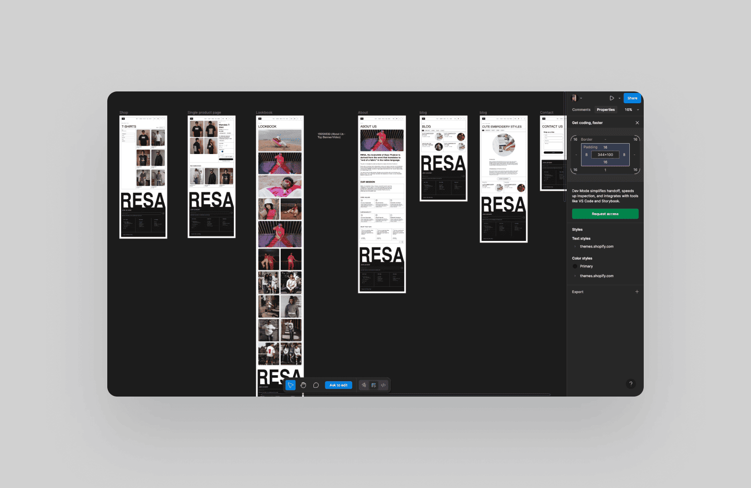
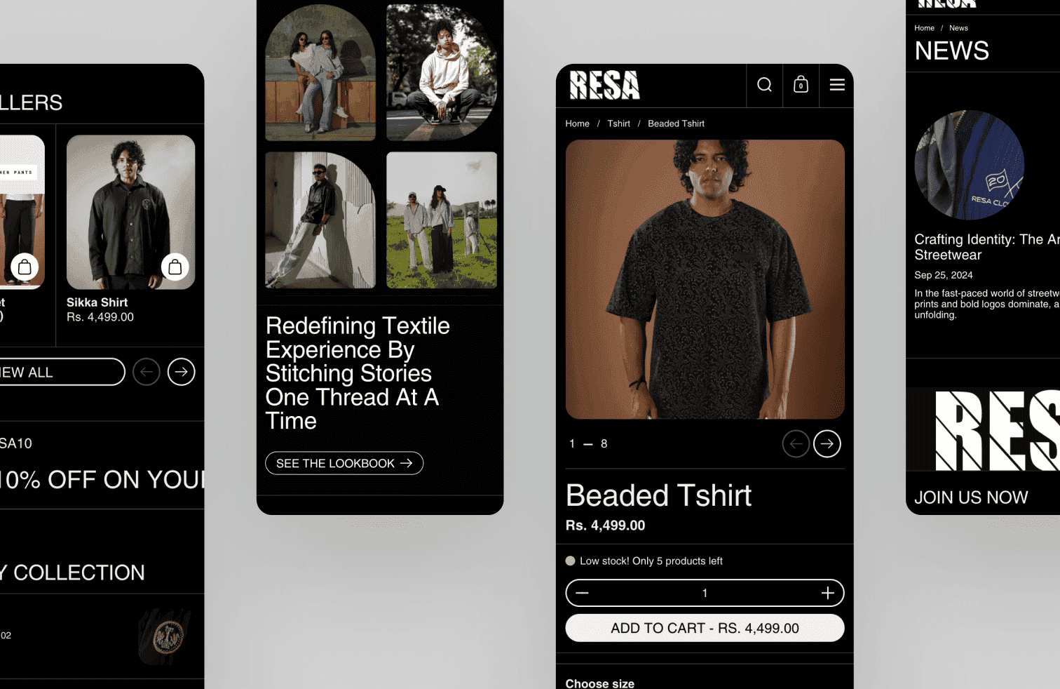
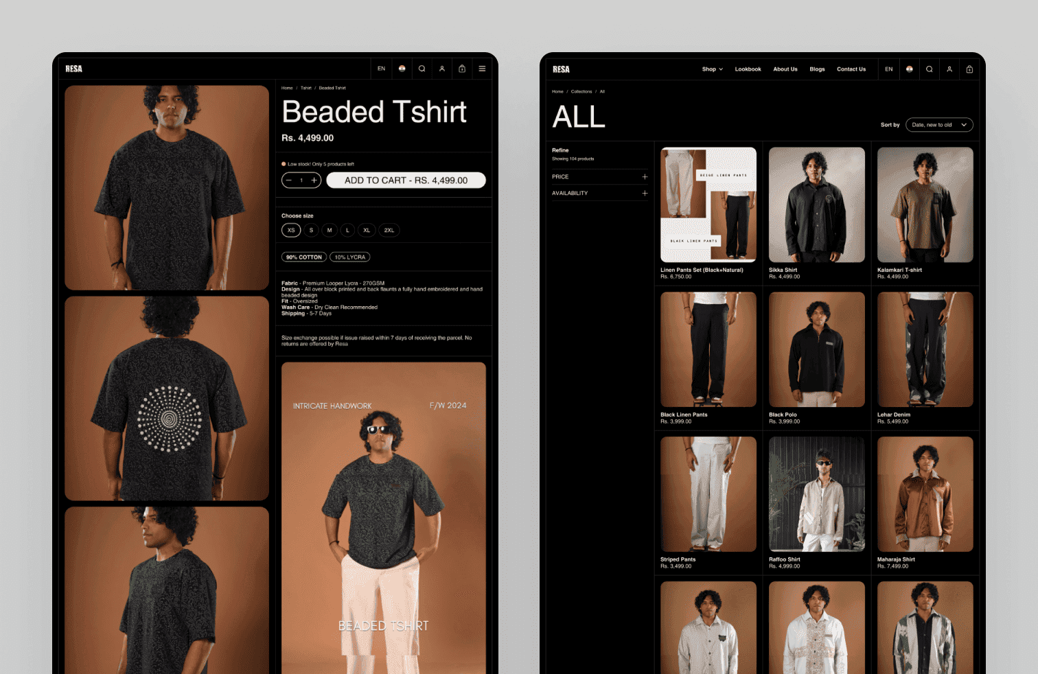
Resa Clothing
Background
The Challenge
Information Architecture
Resa Clothing was founded in 2022 by Deev Thakrar with a vision to push the boundaries of textile art and design. Inspired by Indian culture and heritage, the brand blends craftsmanship, storytelling, and contemporary fashion. Every collection is mindful from fabric sourcing to content strategy, reflecting creativity and attention to detail. With unique drops like the Minar Set, Resa delivers not just clothing but an immersive sartorial experience.
For this project, I handled the end-to-end design and development of the brand’s website, collaborating with one designer and one developer. My focus was on creating a clean, responsive design that captured the brand’s identity while ensuring a smooth development process. I worked closely with the client to meet expectations, refine details, and deliver a fast, functional build. The result was a digital presence that aligned seamlessly with Resa’s vision of artistry and storytelling.
Research & Exploring the Structure
User interviews were conducted by the core team in Tennessee. While I wasn't present for the sessions, I synthesised the findings with the team to align on which workflows were essential for mobile and which were better suited to remain on desktop. This conversation became the foundation for every structural decision that followed.
With the scope defined, three structural approaches were explored:
Assessments, sessions, and goals as separate destinations linked by session IDs. Familiar, but required jumping across sections to complete one task.
Navigation simplified, bottom nav removed, but the three still lived independently. Less clutter, same fragmentation.
Everything was organised within the session itself. One entry point, one context, no jumping between sections.
Option 3 was chosen because it matched how patients naturally think about their care: in terms of sessions, not categories. If a patient wants to do anything related to one session, they go there and nowhere else. It also clarified the mobile scope — the session was the sole task we wanted to support on mobile. Everything else that felt too complex was intentionally left on desktop.
Interactive Prototype